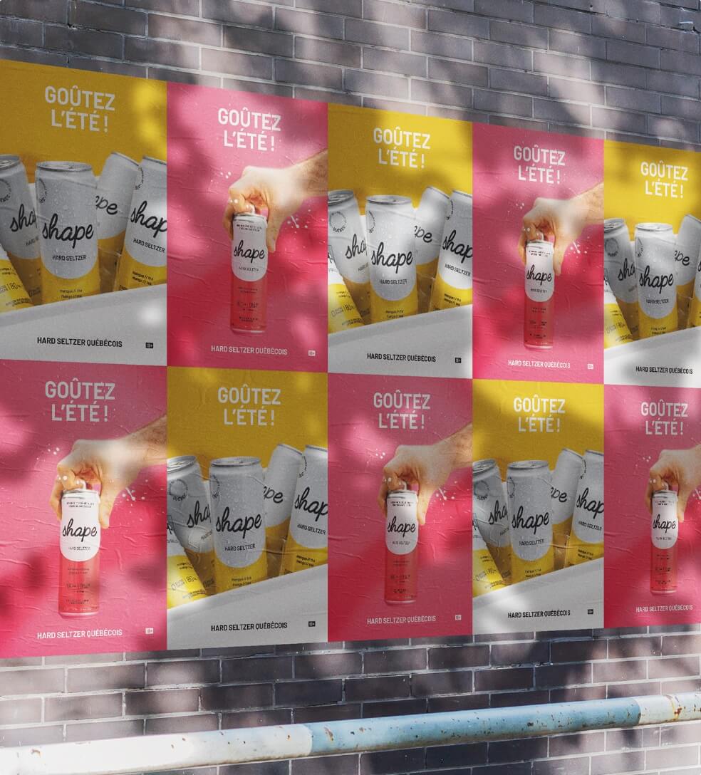
- Advertising
- Identity
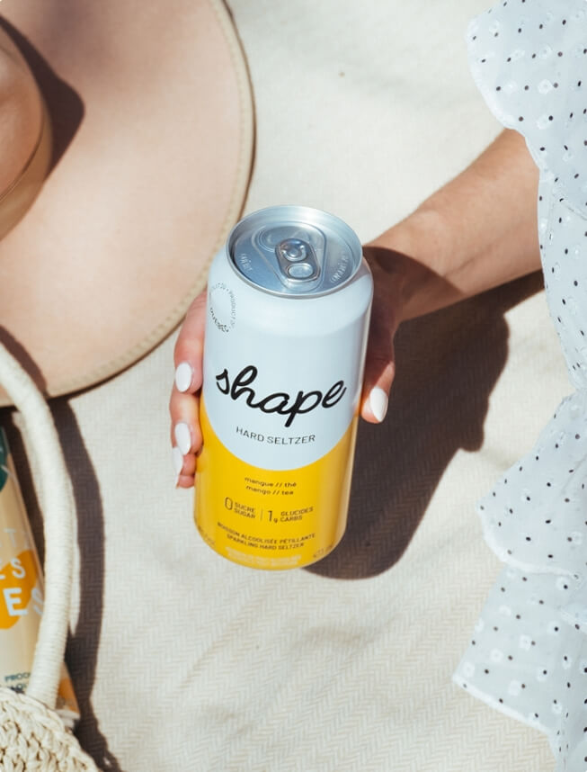
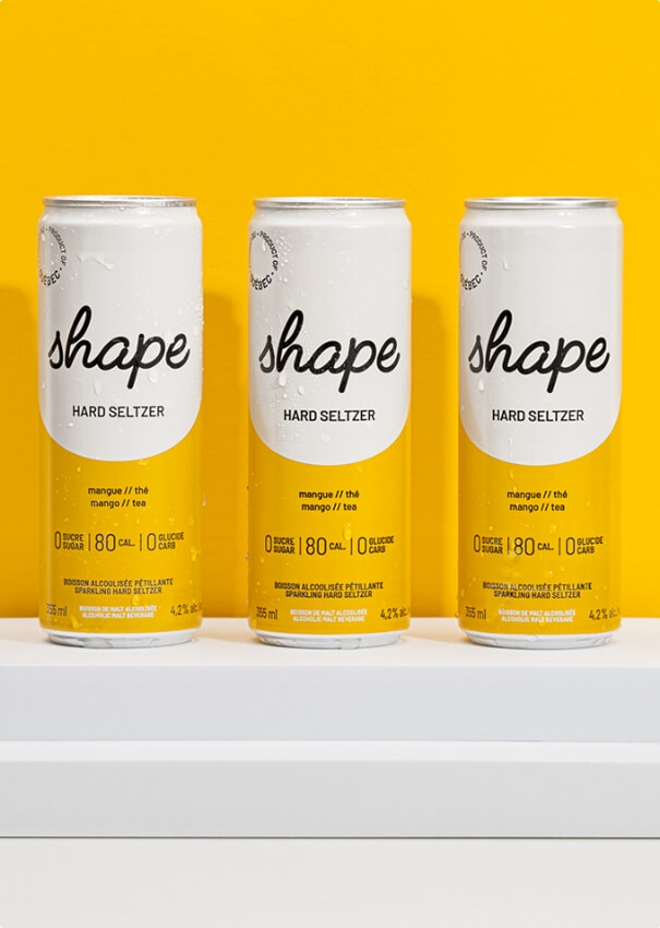
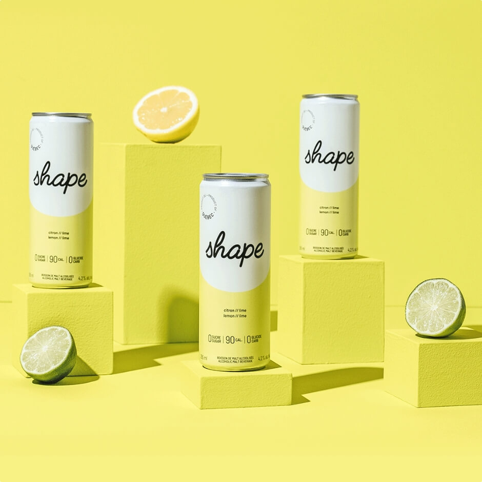
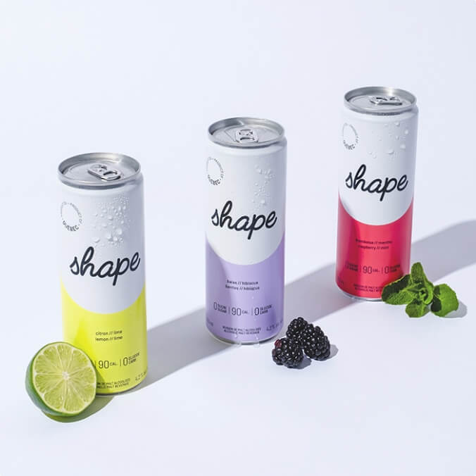
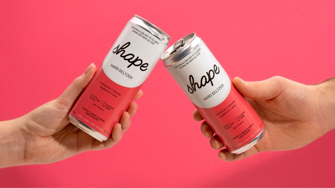
- Packaging
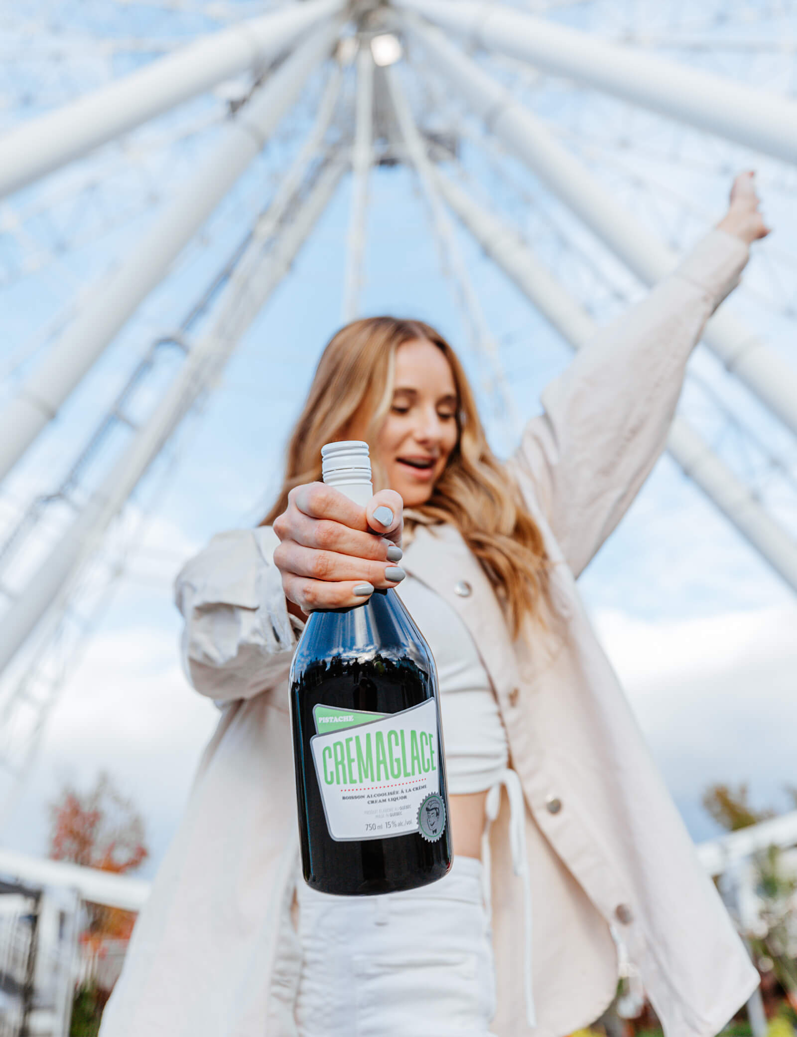
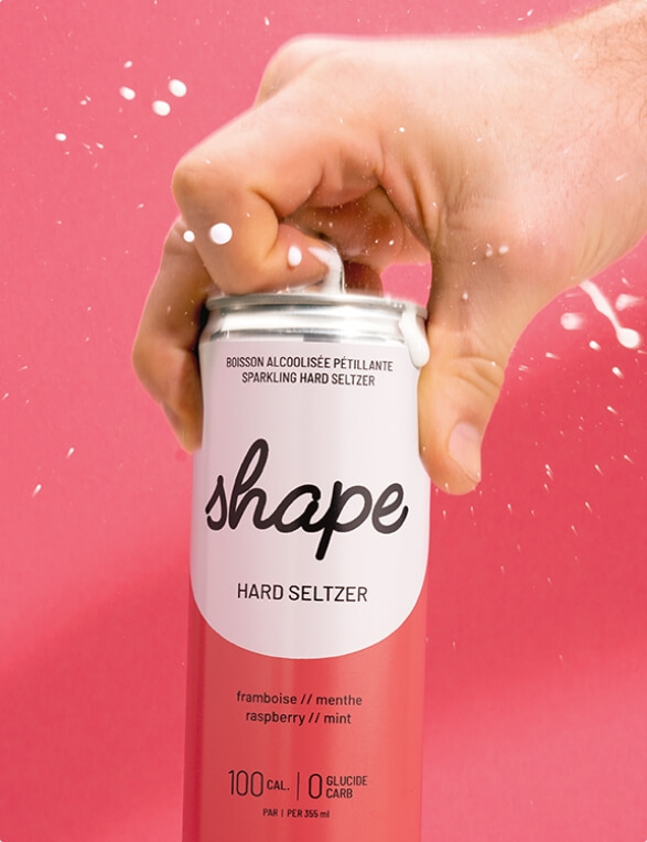
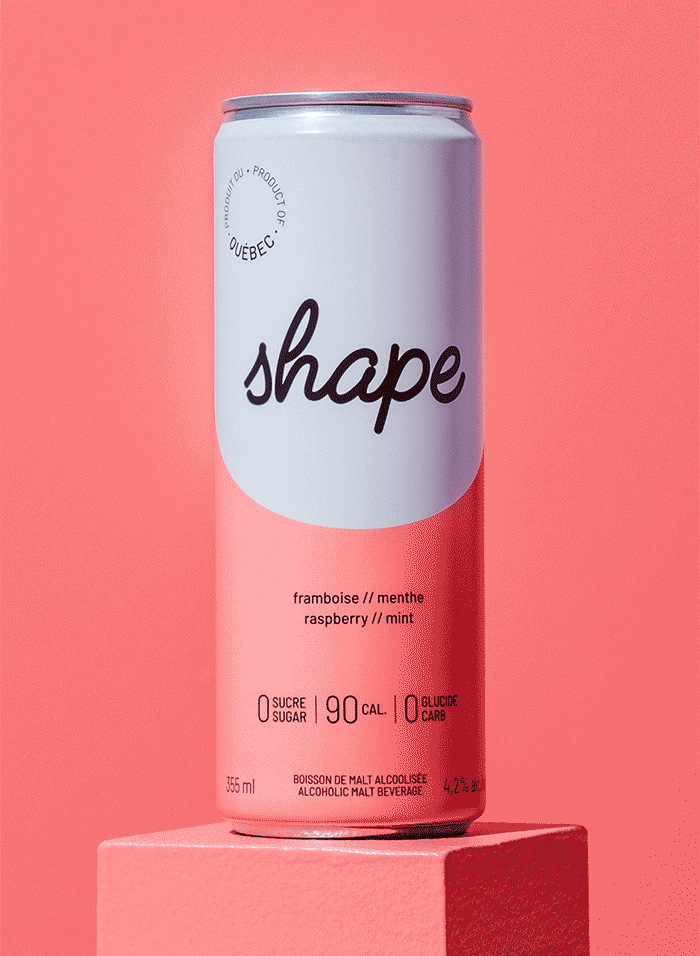
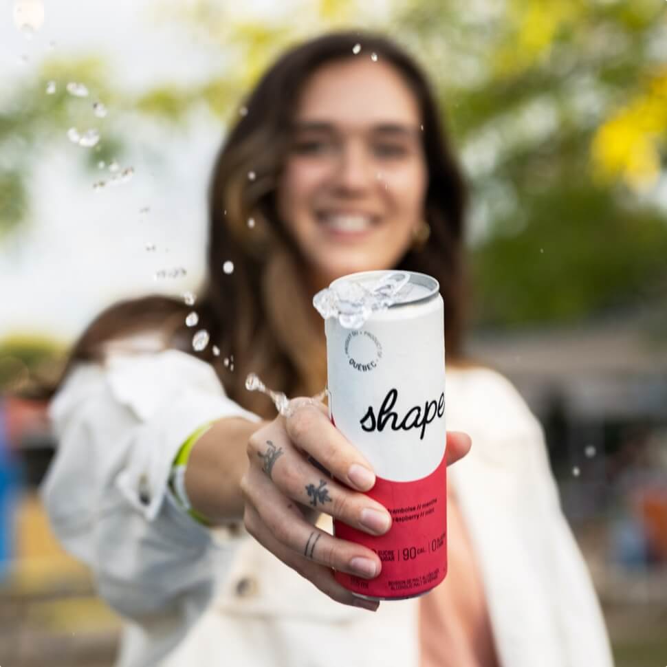
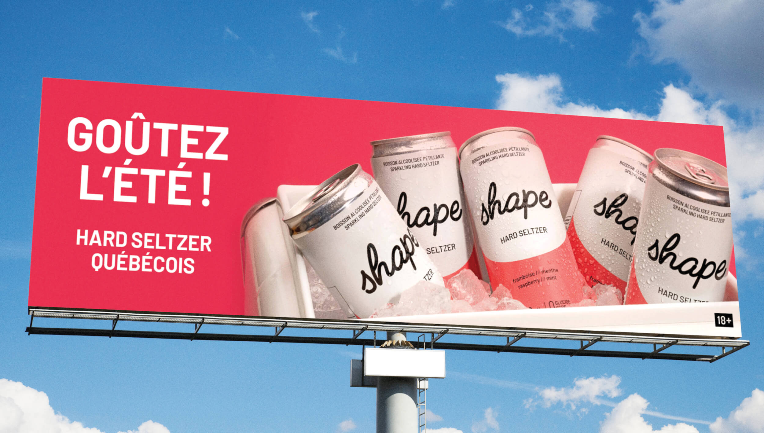
We created a minimalist look to reflect Shape's pared-down list of ingredients and used vibrant colours to represent the fresh flavours of this made-in-Quebec hard seltzer.
Shape hard seltzer
-
Creative Direction
Benoit Mc Nicoll
-
Art Direction
Noëmie Pagé, Caroline Asselin et Éric Lamontagne
-
Graphic Design
Caroline Asselin
-
Photo
Duo Tang, Patricia Brochu
-
Photo
Content Content, Simon Lebrun
-
Photo
Namaste Vo
Related projects