- Branding
- Identity
- Packaging
- Strategy
After reflecting on how to strategically bring the brand closer to families, we completely reinvented the La Petite Bretonne brand.
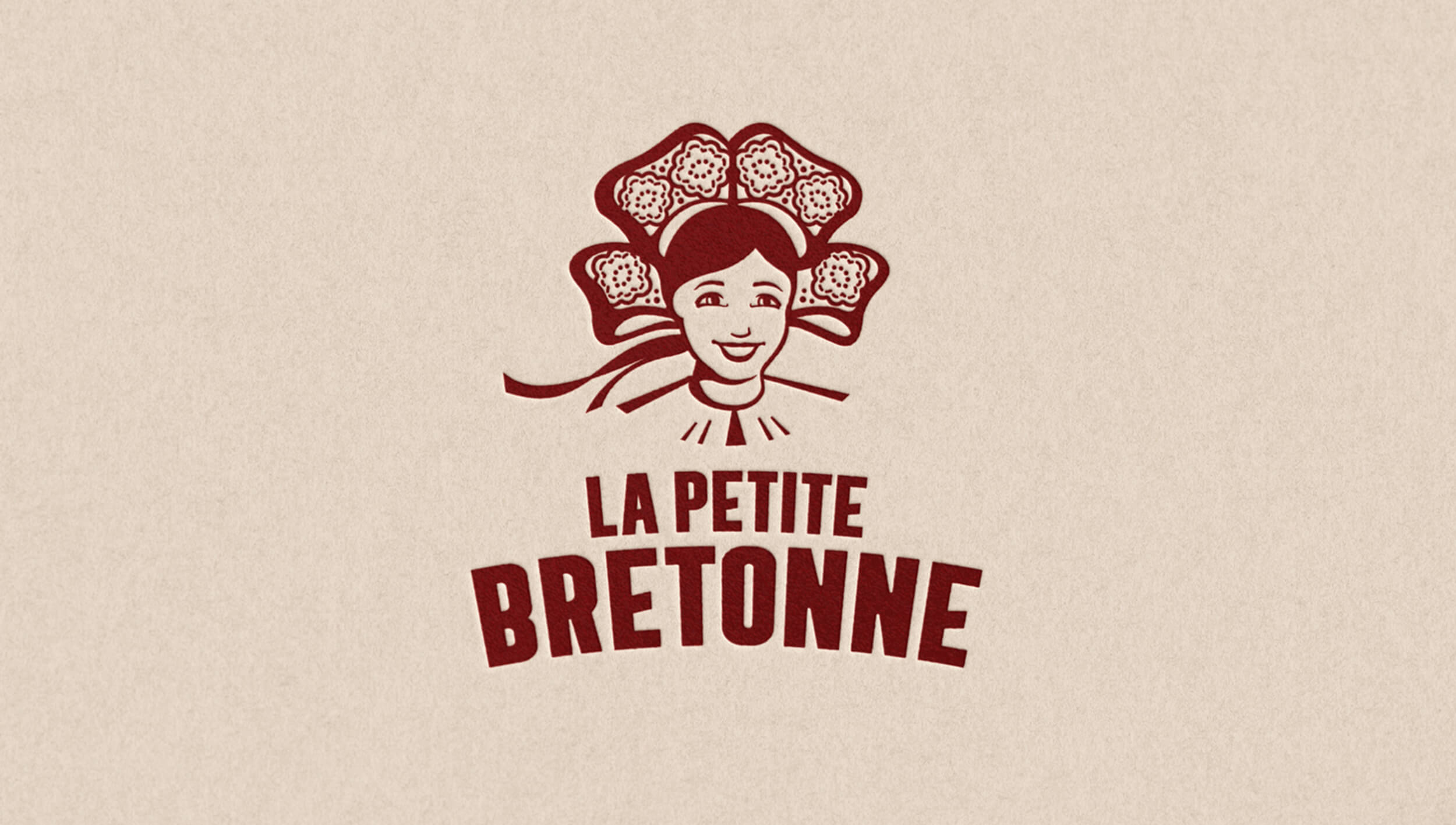
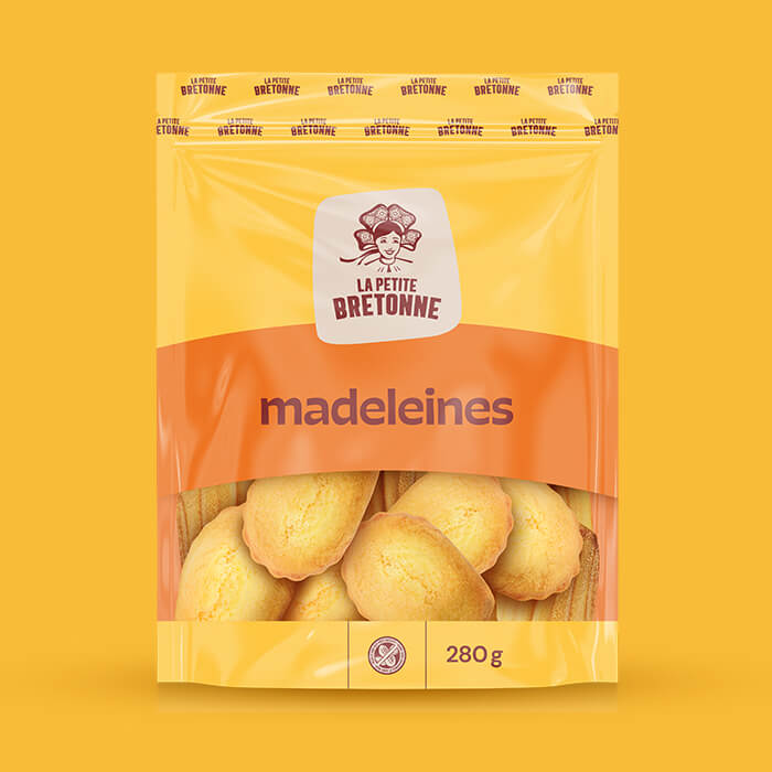
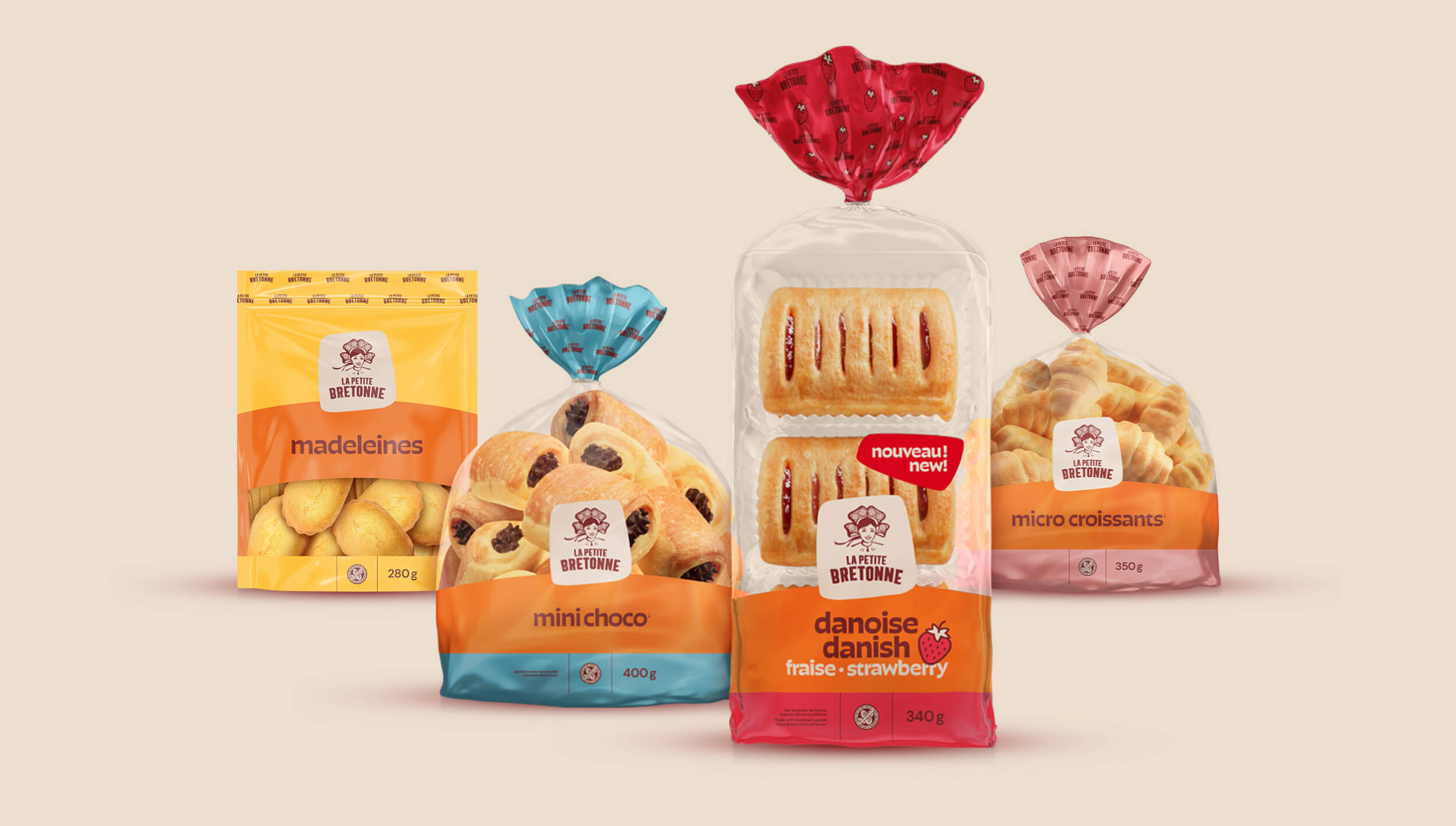
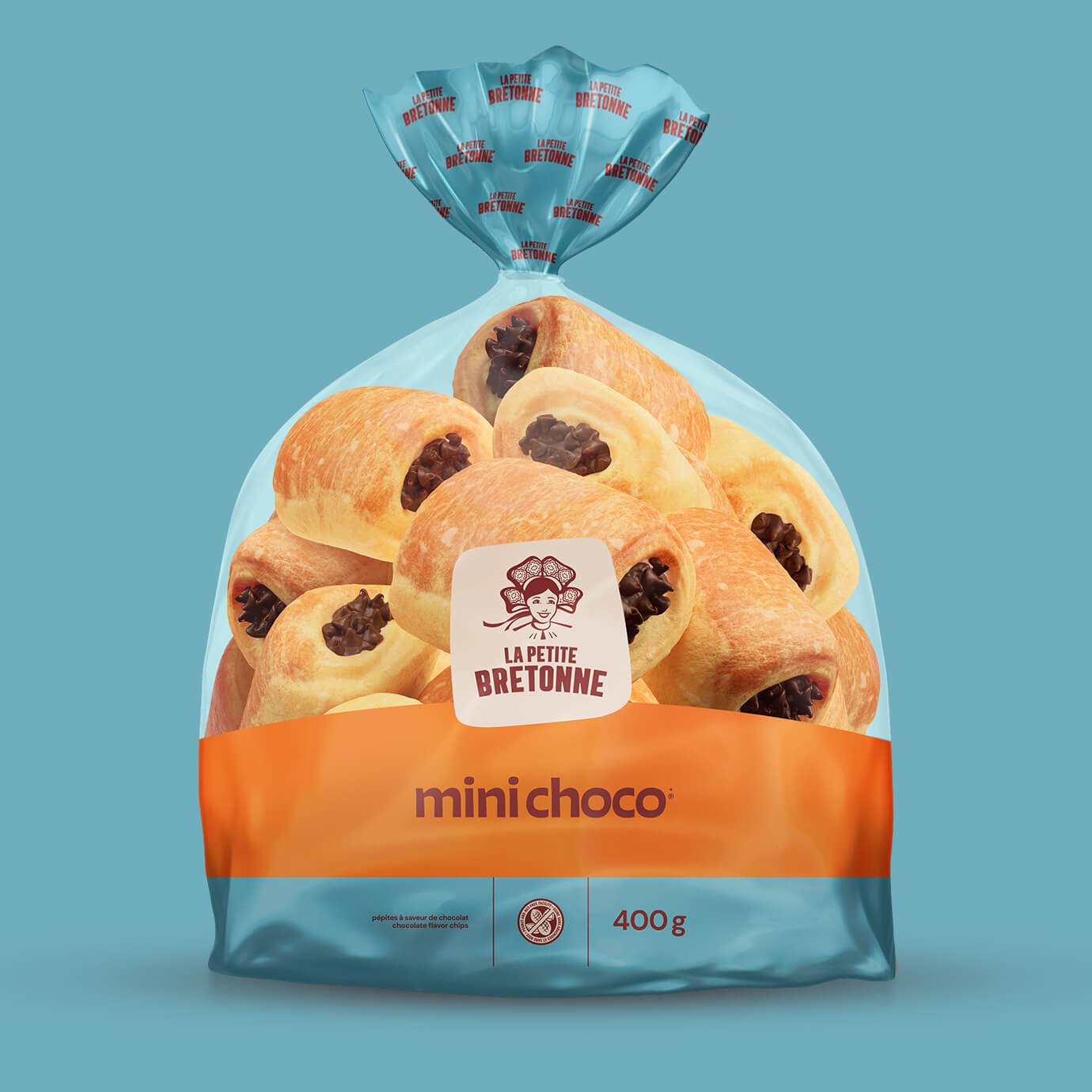
This included redesigning the graphic platform while taking into account two important considerations: the specific codes used in supermarket bakery sections and the warm, people-focused values behind this proudly Quebecois family business. The logo is set against a beige background, reflecting the flour used to make their products. The font is slightly puffy, like dough rising as it bakes. The illustration of the "Petite Bretonne" girl was redesigned to give her a more authentic and confident look. As a result of these changes, the brand now has a strong, contemporary, relatable and proud image.
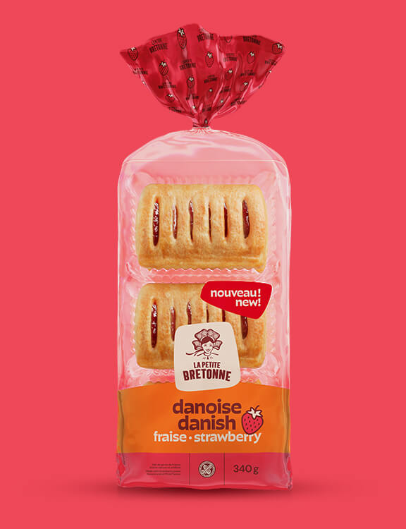
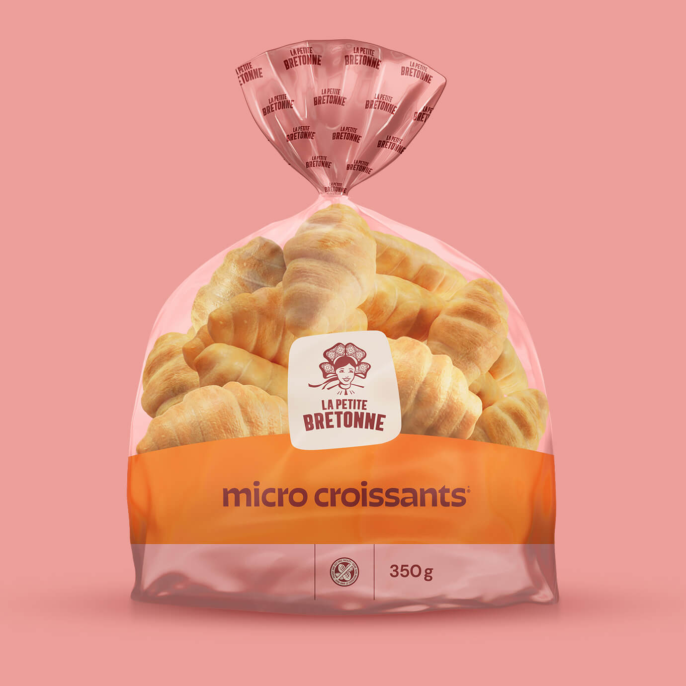
For the product line, we developed a pared-down design that leaves room for the new logo and allows the new navigation colours to stand out so that consumers can find what they're looking for with ease. Orange, the brand's distinctive colour, is the common theme.
La Petite Bretonne


-
Strategy
Justine Benoit et Benoit Mc Nicoll
-
Creative Direction
Benoit Mc Nicoll
-
Art Direction
Noëmie Pagé
-
Illustration
Noëmie Pagé
-
Photo
Tango et Julia Marois
-
Video
Janis Mc Nicoll
-
CGI
Baillat Studio
Related projects