-
-
Advertising
-
Identity
-
Packaging
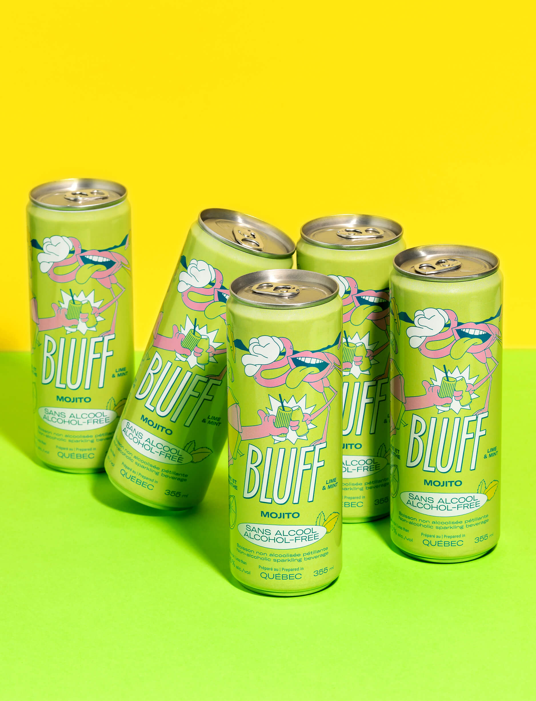
BLUFF
Client since 2022
The excitement is real at the games table!
We played our cards right by personalizing these mocktails in collaboration with the artist MAIKA MTL. Zero proof. Tons of fun. Let’s play! -
-
-
Advertising
-
Identity
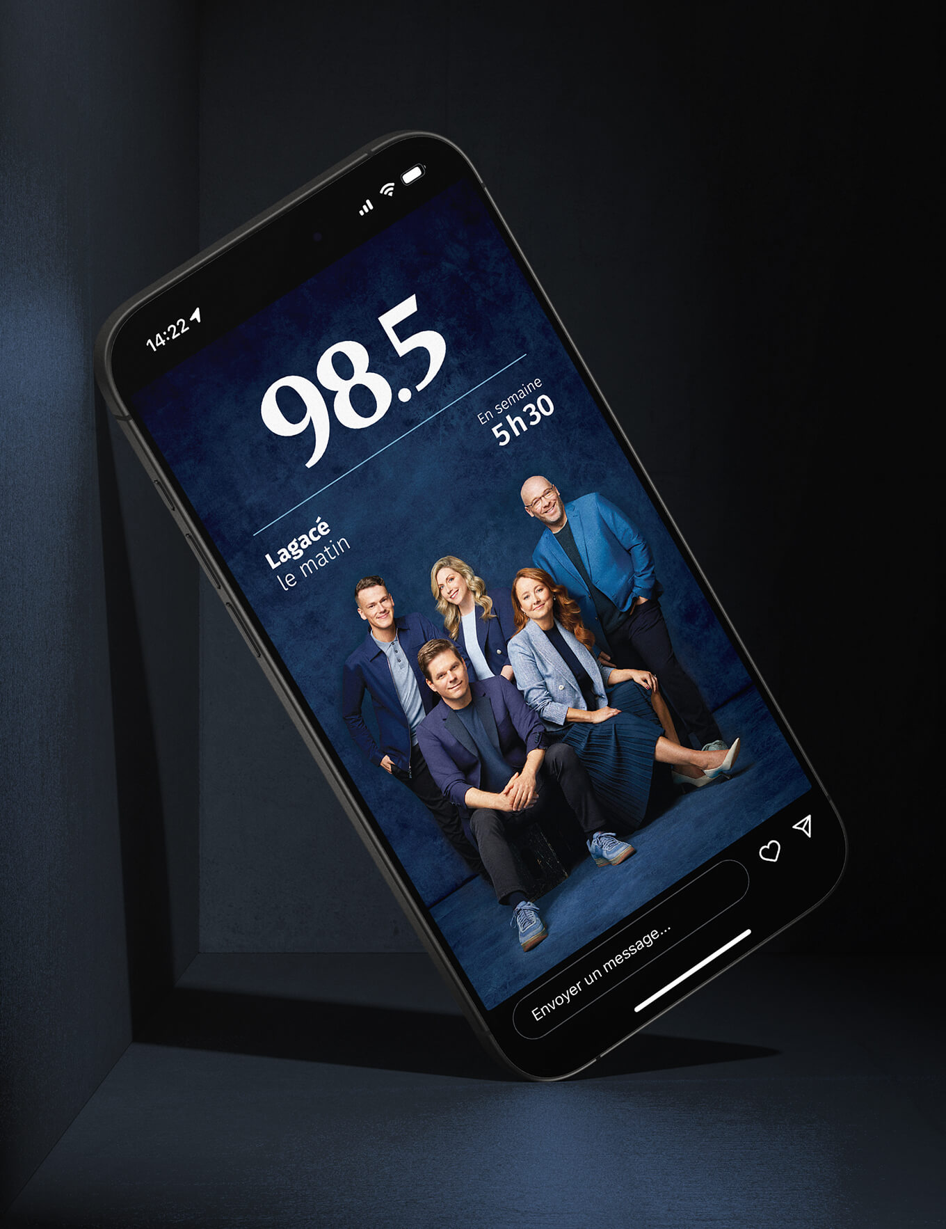
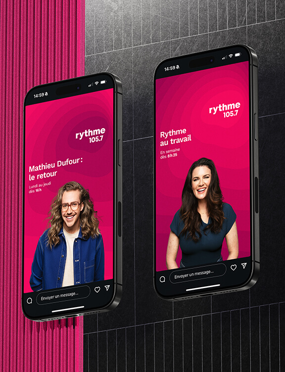
98,5 FM
Client since 2010
What’s in a name? Sometimes it’s everything. Literally. Patrick Lagacé. Nathalie Normandeau. Philippe Cantin. Real personalities who tell real stories.
-
-

-
Advertising
-
Identity
CKOI
Client since 2010
Could we find one word to summarize the thousands of words that flow from one radio station per day, along with the larger-than-life personalities of its hosts? Yessssss.
-
-
-
Branding
-
Packaging
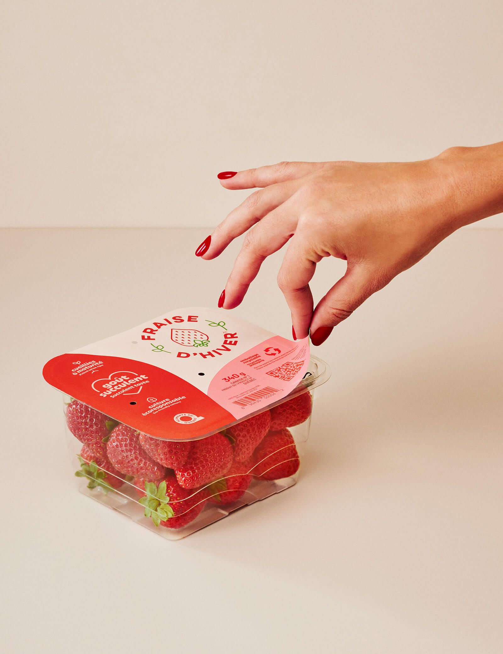
Fraise d’Hiver
Client since 2020
When designing the new packaging and brand platform for Fraise d’Hiver, our challenge was to showcase the succulent fruit’s sweet taste and the many benefits of local production using revolutionary vertical growing systems.
-
-

-
Advertising
-
Campaign
-
Strategy
Fédération des médecins spécialistes du Québec
Client since 2015
Orchestrated in collaboration with the Fédération des médecins spécialistes du Québec, the Providing Care campaign aims to raise public awareness of the challenges that specialist physicians face, as well as their tireless work to ensure their patients receive the best possible care. Bunka designed a strong visual identity and impactful messages to underscore the dedication of Quebec’s medical specialists. The multi-channel campaign was rolled out online as well as on billboards, radio and television. The key message emphasizes what drives the province’s 11,000 specialist physicians: a commitment to providing care.
-
-
-
Advertising
-
Identity
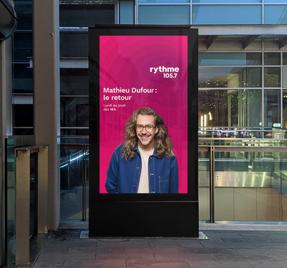
Rythme FM
Client since 2009
How do you express that "feel good" radio vibe on silent media? We figured it out. Come and see the stars!
-
-
-
Branding
-
Identity
-
Packaging
-
Strategy
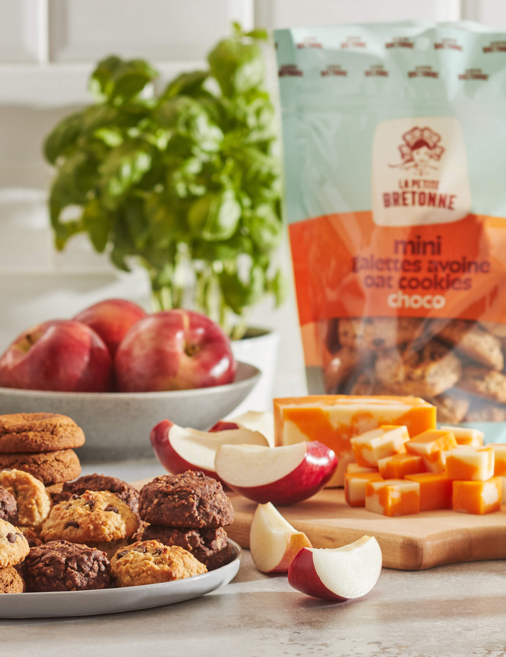
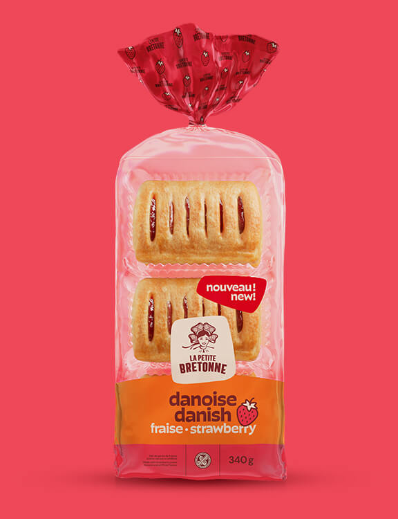
La Petite Bretonne
Client since 2020
After reflecting on how to strategically bring the brand closer to families, we completely reinvented the La Petite Bretonne brand.
This included redesigning the graphic platform while taking into account two important considerations: the specific codes used in supermarket bakery sections and the warm, people-focused values behind this proudly Quebecois family business. The logo is set against a beige background, reflecting the flour used to make their products. The font is slightly puffy, like dough rising as it bakes. The illustration of the "Petite Bretonne" girl was redesigned to give her a more authentic and confident look. As a result of these changes, the brand now has a strong, contemporary, relatable and proud image.
For the product line, we developed a pared-down design that leaves room for the new logo and allows the new navigation colours to stand out so that consumers can find what they’re looking for with ease. Orange, the brand’s distinctive colour, is the common theme. -
-
-
Advertising
-
Campaign
-
Strategy
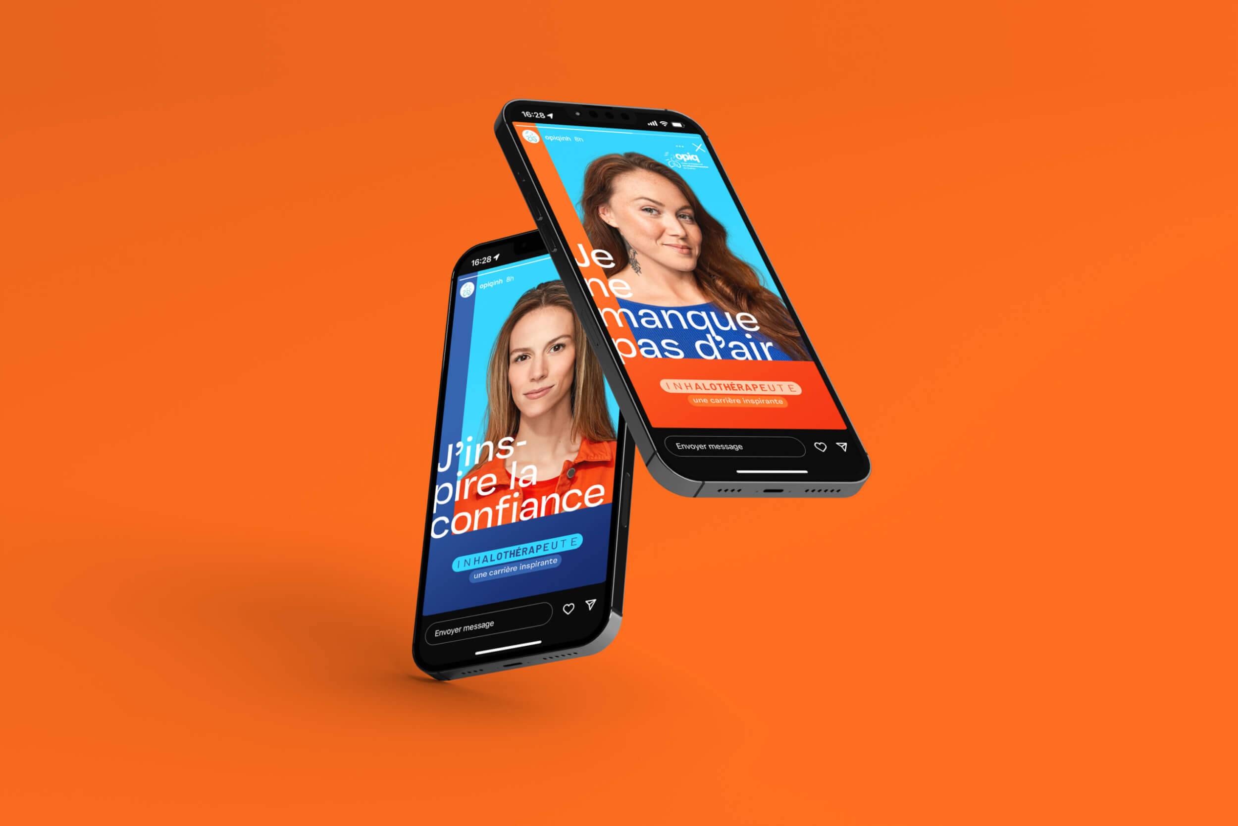
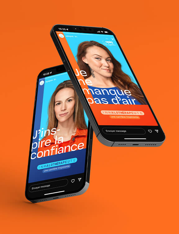
OPIQ
Client since
We developed an ad campaign for the Ordre Professionnel des Inhalothérapeutes du Québec (OPIQ) highlighting the values that drive respiratory therapists across the province. By promoting the profession and letting students know about this inspiring career, we met two objectives all in one breath.
-
-
-
Advertising
-
Advertising
-
Campaign
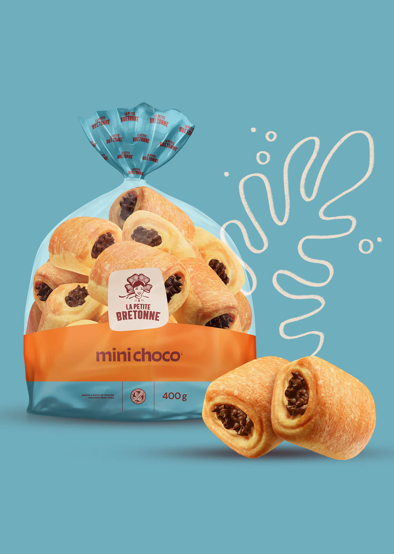
La Petite Bretonne
Client since 2020
This was the spirit of the campaign, which featured animated La Petite Bretonne products having fun in different worlds. The goal was to drive home the message that La Petite Bretonne products are a great choice for a wide range of occasions, not just breakfast. The playful, light-hearted theme was designed to appeal to the brand’s target segments. The all-new brand image and packaging will be featured in a multi-platform ad campaign that includes billboards, television, daily newspapers and digital media.
-
-
-
Advertising
-
Identity
-
Strategy
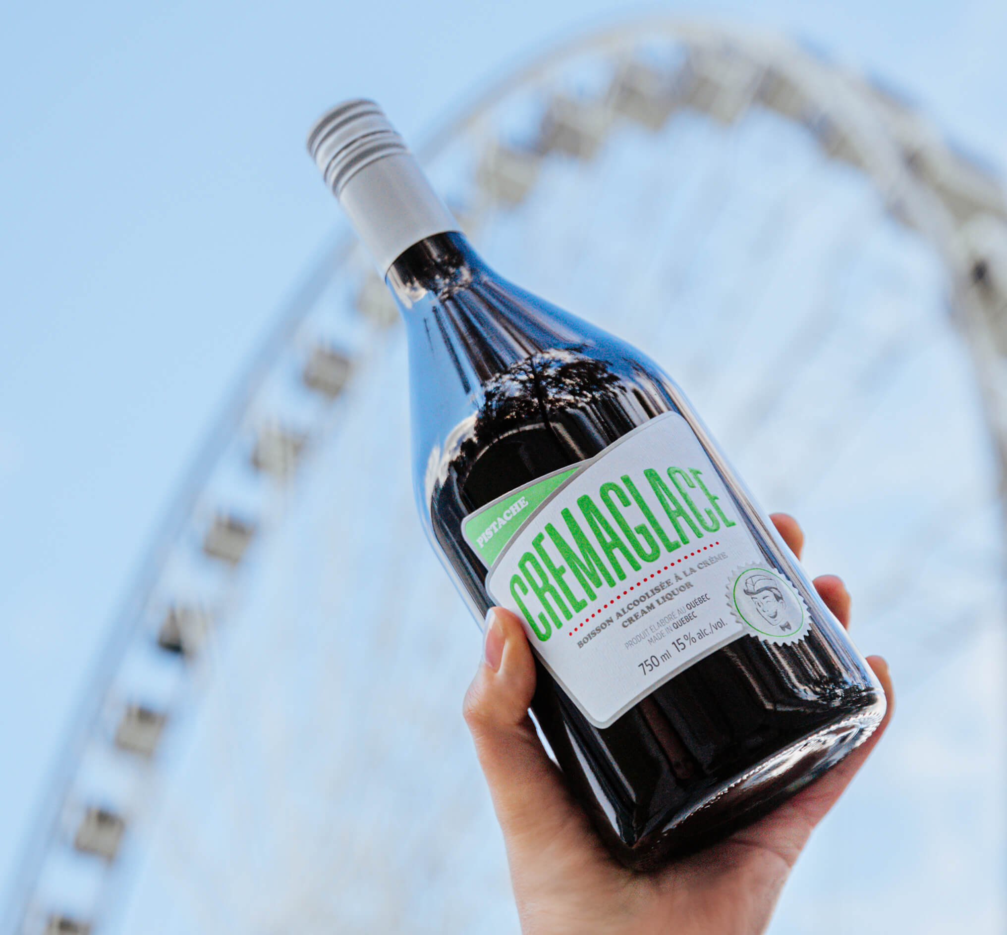
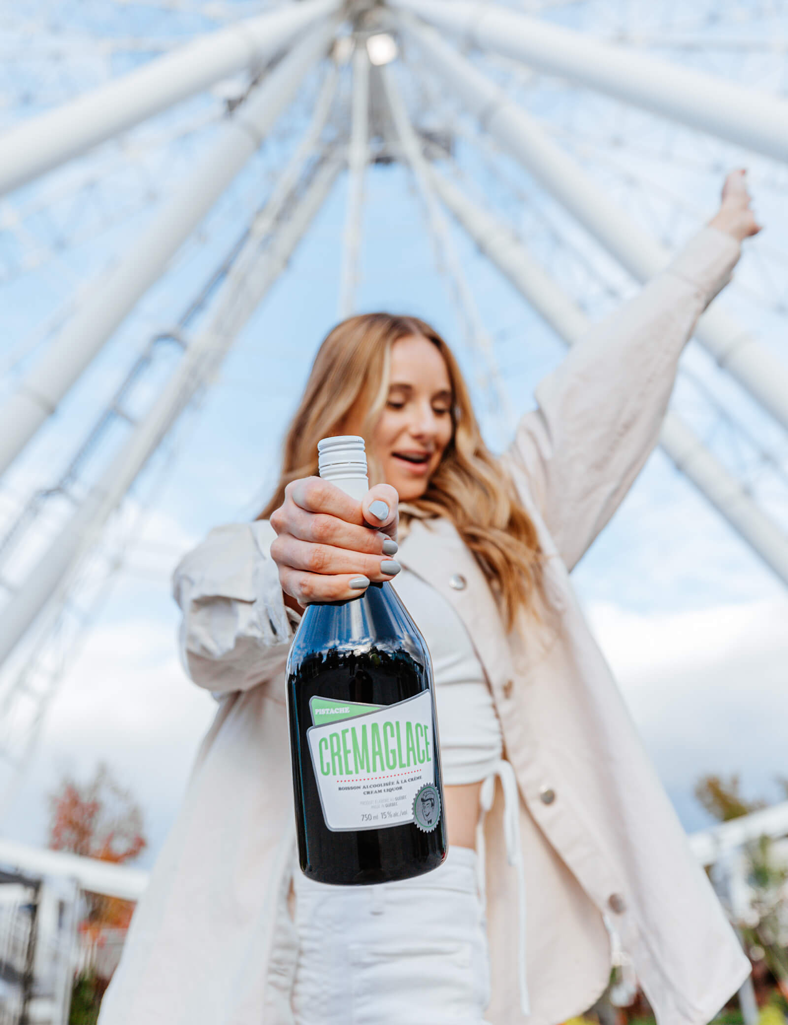
Cremaglace
Client since 2019
Every detail is steeped in nostalgia—from the product name to the iconography, posters and even the cooler. Just like the good old days. But spiked. Because you also need to spoil your grown-up side.
-
-

-
Branding
-
Identity
Paul Arcand
Client since 2024
Reinventing Paul Arcand’s audio universe—the confluence of information, opinions and people—called for a strong visual identity and striking imagery. Exclusive content, fascinating interviews and a totally immersive experience: this is what Paul Arcand promises and delivers.
-
-
-
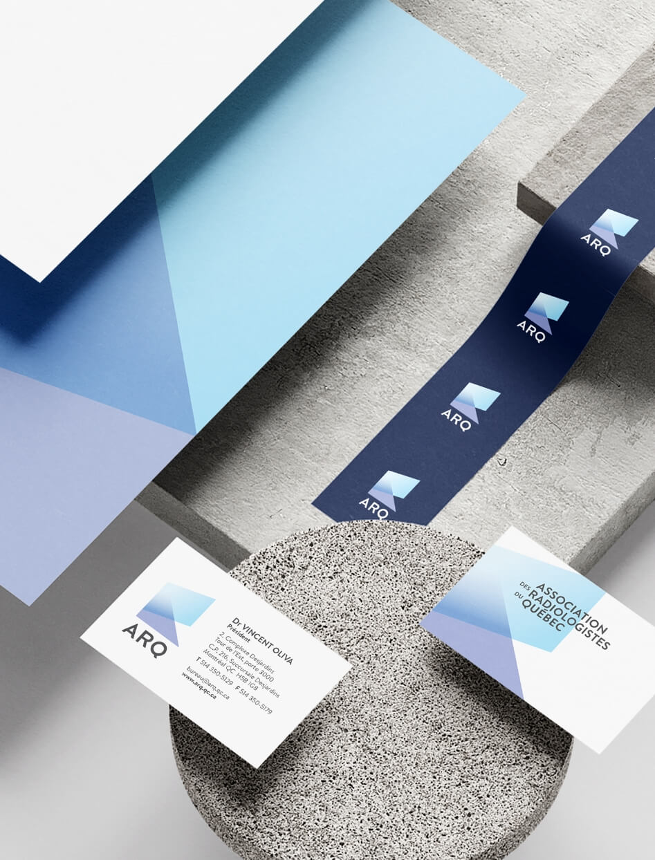
Identity
Association des radiologistes du Québec
Client since 2018
We completely redesigned the logo and brand image for Quebec’s association of radiologists. That’s our kind of medical imaging.
-
-
-
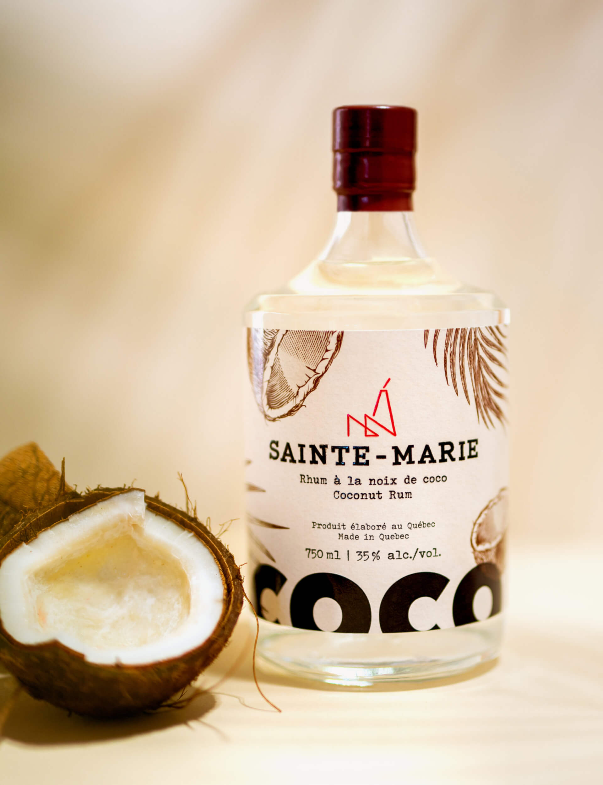
Advertising
-
Identity
-
Packaging
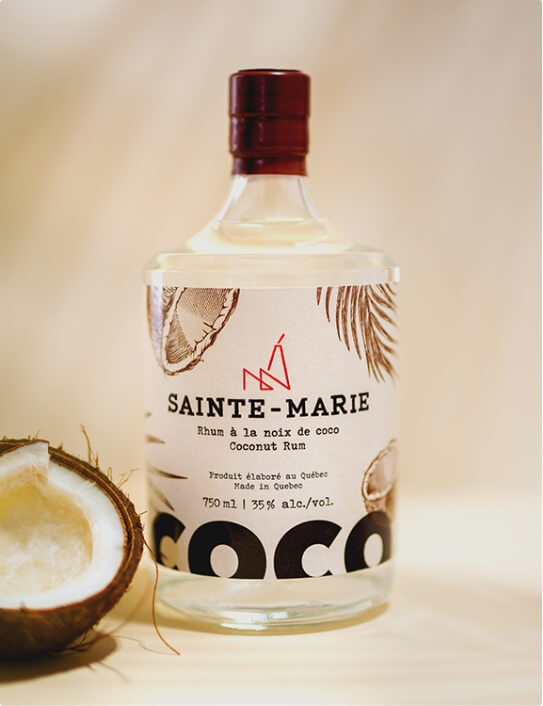
Sainte-Marie Rum
Client since 2017
This spiced rum’s name and visual identity are rooted in Montreal’s former Molasses District.
-
-
-
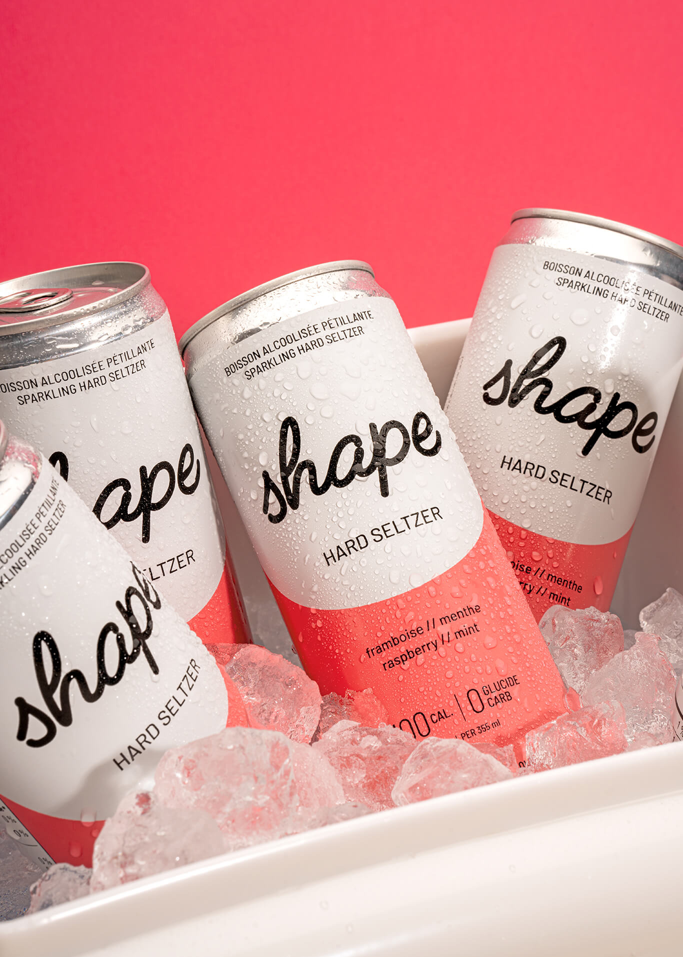
Advertising
-
Identity
-
Packaging
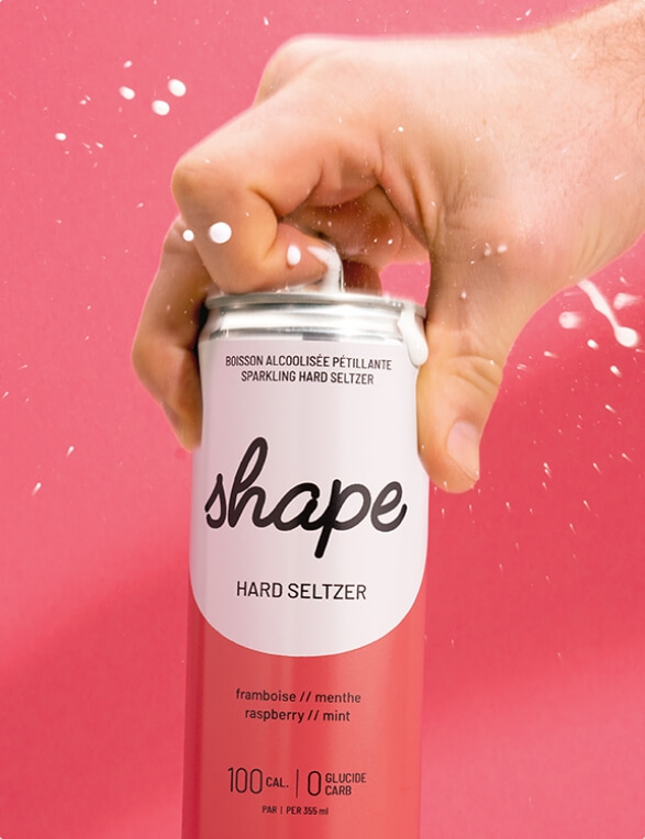
Shape hard seltzer
Client since 2020
We created a minimalist look to reflect Shape’s pared-down list of ingredients and used vibrant colours to represent the fresh flavours of this made-in-Quebec hard seltzer.
-
-

-
Advertising
-
Identity
La Maison Bleue
Client since 2017
In addition to creating La Maison Bleue’s brand identity, we developed a campaign to promote the tremendous community spirit that drives the organization’s social perinatal care services.
-
-

-
Identity
Productions Déferlantes
Client since 2017
We aimed to capture the imagination by infusing the complexity and contagious energy of dance into the brand’s identity and communications. Can you feel it?
-
-
-
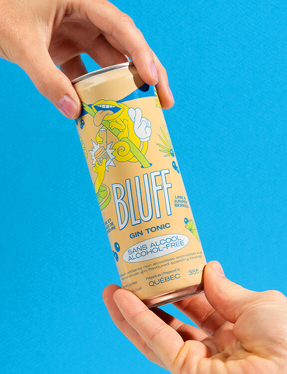
Advertising
-
Identity
-
Packaging
BLUFF
Client since 2022
The excitement is real at the games table!
We played our cards right by personalizing these mocktails in collaboration with the artist MAIKA MTL. Zero proof. Tons of fun. Let’s play! -
-
-
Advertising
-
Identity
98,5 FM
Client since 2010
What’s in a name? Sometimes it’s everything. Literally. Patrick Lagacé. Nathalie Normandeau. Philippe Cantin. Real personalities who tell real stories.
-
-

-
Advertising
-
Identity
CKOI
Client since 2010
Could we find one word to summarize the thousands of words that flow from one radio station per day, along with the larger-than-life personalities of its hosts? Yessssss.
-
-
-
Branding
-
Packaging
Fraise d’Hiver
Client since 2020
When designing the new packaging and brand platform for Fraise d’Hiver, our challenge was to showcase the succulent fruit’s sweet taste and the many benefits of local production using revolutionary vertical growing systems.
-
-
-
Advertising
-
Campaign
-
Strategy
Fédération des médecins spécialistes du Québec
Client since 2015
Orchestrated in collaboration with the Fédération des médecins spécialistes du Québec, the Providing Care campaign aims to raise public awareness of the challenges that specialist physicians face, as well as their tireless work to ensure their patients receive the best possible care. Bunka designed a strong visual identity and impactful messages to underscore the dedication of Quebec’s medical specialists. The multi-channel campaign was rolled out online as well as on billboards, radio and television. The key message emphasizes what drives the province’s 11,000 specialist physicians: a commitment to providing care.
-
-
-
Advertising
-
Identity
Rythme FM
Client since 2009
How do you express that "feel good" radio vibe on silent media? We figured it out. Come and see the stars!
-
-
-
Branding
-
Identity
-
Packaging
-
Strategy
La Petite Bretonne
Client since 2020
After reflecting on how to strategically bring the brand closer to families, we completely reinvented the La Petite Bretonne brand.
This included redesigning the graphic platform while taking into account two important considerations: the specific codes used in supermarket bakery sections and the warm, people-focused values behind this proudly Quebecois family business. The logo is set against a beige background, reflecting the flour used to make their products. The font is slightly puffy, like dough rising as it bakes. The illustration of the "Petite Bretonne" girl was redesigned to give her a more authentic and confident look. As a result of these changes, the brand now has a strong, contemporary, relatable and proud image.
For the product line, we developed a pared-down design that leaves room for the new logo and allows the new navigation colours to stand out so that consumers can find what they’re looking for with ease. Orange, the brand’s distinctive colour, is the common theme. -
-
-
Advertising
-
Campaign
-
Strategy
OPIQ
Client since
We developed an ad campaign for the Ordre Professionnel des Inhalothérapeutes du Québec (OPIQ) highlighting the values that drive respiratory therapists across the province. By promoting the profession and letting students know about this inspiring career, we met two objectives all in one breath.
-
-
-
Advertising
-
Advertising
-
Campaign
La Petite Bretonne
Client since 2020
This was the spirit of the campaign, which featured animated La Petite Bretonne products having fun in different worlds. The goal was to drive home the message that La Petite Bretonne products are a great choice for a wide range of occasions, not just breakfast. The playful, light-hearted theme was designed to appeal to the brand’s target segments. The all-new brand image and packaging will be featured in a multi-platform ad campaign that includes billboards, television, daily newspapers and digital media.
-
-
-
Advertising
-
Identity
-
Strategy
Cremaglace
Client since 2019
Every detail is steeped in nostalgia—from the product name to the iconography, posters and even the cooler. Just like the good old days. But spiked. Because you also need to spoil your grown-up side.
-
-

-
Branding
-
Identity
Paul Arcand
Client since 2024
Reinventing Paul Arcand’s audio universe—the confluence of information, opinions and people—called for a strong visual identity and striking imagery. Exclusive content, fascinating interviews and a totally immersive experience: this is what Paul Arcand promises and delivers.
-
-
-
Identity
Association des radiologistes du Québec
Client since 2018
We completely redesigned the logo and brand image for Quebec’s association of radiologists. That’s our kind of medical imaging.
-
-
-
Advertising
-
Identity
-
Packaging
Sainte-Marie Rum
Client since 2017
This spiced rum’s name and visual identity are rooted in Montreal’s former Molasses District.
-
-
-
Advertising
-
Identity
-
Packaging
Shape hard seltzer
Client since 2020
We created a minimalist look to reflect Shape’s pared-down list of ingredients and used vibrant colours to represent the fresh flavours of this made-in-Quebec hard seltzer.
-
-
-
Advertising
-
Identity
La Maison Bleue
Client since 2017
In addition to creating La Maison Bleue’s brand identity, we developed a campaign to promote the tremendous community spirit that drives the organization’s social perinatal care services.
-